16 images
Assignment instructions
Take 4 x 4 photographs that illustrate the following colour relationships:
- harmony through complementary colours
- harmony through similar colours
- contrast through contrasting colours
- colour accent using any of the previous relationships
Vary subject matter between still-life and found scenes.
Use lighting and filters to help create colours
Make notes about the way colour works in each image
Sketch how balance and movement works in each
Images and review
Tutor's comments
Overall
Approach
Complementary colours - harmony
(1) Red and Green
Overall
- Mostly a good understanding of the use of colour but the close simple nature of the subjects lets it down
- Prints submitted for review were not as saturated as they appear in the blog (especially: 1, 2, 5 and 9). Need to improve print quality.
- Blog is well ordered but light in the important areas of (a) evaluating what does and does not work visually, de-constructing images in terms of colour, light and design and (b) revealing purpose and thinking behind images
Suggestions for next section - Light
Photographers
- Trent Parke
- Boris Savelev
Approach
- Make monochrome and colour images, at different times of day and different weather conditions
- Make use of flash, both for interiors (bounced) and fill flash for exteriors in daylight to add emphasis
Complementary colours - harmony
Use of colours that are polar opposites on the Colour Wheel. Key combinations are: red and green, blue and orange, violet and yellow.
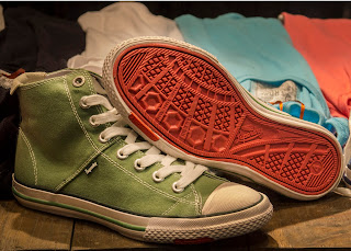
(1) Red and Green
 |
| Shoes on sale on display in window of Super Dry store in Covent Garden, London. Red and green are approximately as bright as each other, so are harmonious in equal quantities, as here. |
(2) Blue and Orange
(3) Red and Green
Red crane somewhat over-saturated
(4) Red and Green
 |
Autumn Leaves #1
The equal relationship of warm red/orange
and range of greens creates harmony.
(Image comes from panning on a slow shutter speed between trees.) |
Similar colours - harmony
Use of colours that lie adjacent to each other in the Colour Wheel
(5) Red, Yellow, Orange and Violet
 |
| Autumn leaves #2 The leaves cover the warm colours of red, orange and yellow, as well as violet, adjacent to red |
 |
| Colonnade near the piazza in Verona, Italy. The stone as well as the light and shade create tones of yellow |
(7) Blue and Green
(8) Red and Yellow
Watch out for leaking light turning dark backgrounds grey (top right).
Contrasting colours - contrast
Use of colours that lie one third of the way around the Colour Wheel. Key combinations are: red and blue, red and yellow, orange and green, orange and violet, blue and yellow, green and violet
(9) Orange and Violet
(10) Yellow and Blue
 |
| Office block at St Giles Circus, London. The bright yellow stands out against the (rare) clear blue sky |
(11) Yellow and Green
As green and yellow are adjacent colours, this belongs in Section 2 - Similar Colours: Harmony.
(12) Red and Blue
 |
| Flip-flops on display in Super Dry store in Covent Garden, London Both yellow and green flip-flops are very bright colours (probably visible from out of space) |
(12) Red and Blue
New office block
in Cannon Street, London. The red advertisement around the revolving door contrasts with the blue backlit panels behind reception |
Colour accent - harmony or contrast
Use of a dominant colour set with a small quantity of a contrasting colour which creates a point of focus in the image
(13) Green accent on Red
 |
| Apples on display at local Waitrose (thanks to manager for giving permission) The green apple catches the eye amongst the display of similar red apples |
(14) Yellow, Blue, Green and Orange accents on sky Blue
(15) Red accent on Blue


