Tuesday, 20 September 2011

Vertical vs Horizontal (1.4)


Requirement
c 20 photographs twice

Purpose

  • To break the habit of always shooting in horizontal orientation (interia caused by camera design)
  • To show that you can make most scenes work vertically as well as horizontally, although for each situation one orientation is likely to be more effective than the other


Technical learning

  • The Golden Section is a classical way of dividing the frame since it tends to produce most people’s idea of balance within an image
  •  The Rule of Thirds is approximates the Golden Section. However, it is a rule to guide not follow slavishly. 
  •  You can discover other coherent ways of dividing the frame (a) by studying painters or photographers or (b) by using formats other than 3:2 such as 4:3, 16:9 or panoramic


Exercise instructions

Select a compact location – photograph the same scene twice. Take 20 images in vertical format.  Choose the settings for yourself, e.g. street scenes, landscapes. Take next 20 shots in horizontal format. Shoot a horizontal version of the vertical shot.


Images and Review
Bending the rules slightly, I have been taking vertical and horizontal of scenes simultaneously over a number of weeks. Here are 15 examples.

(1) The buildings and cafe at the Tate Modern, London
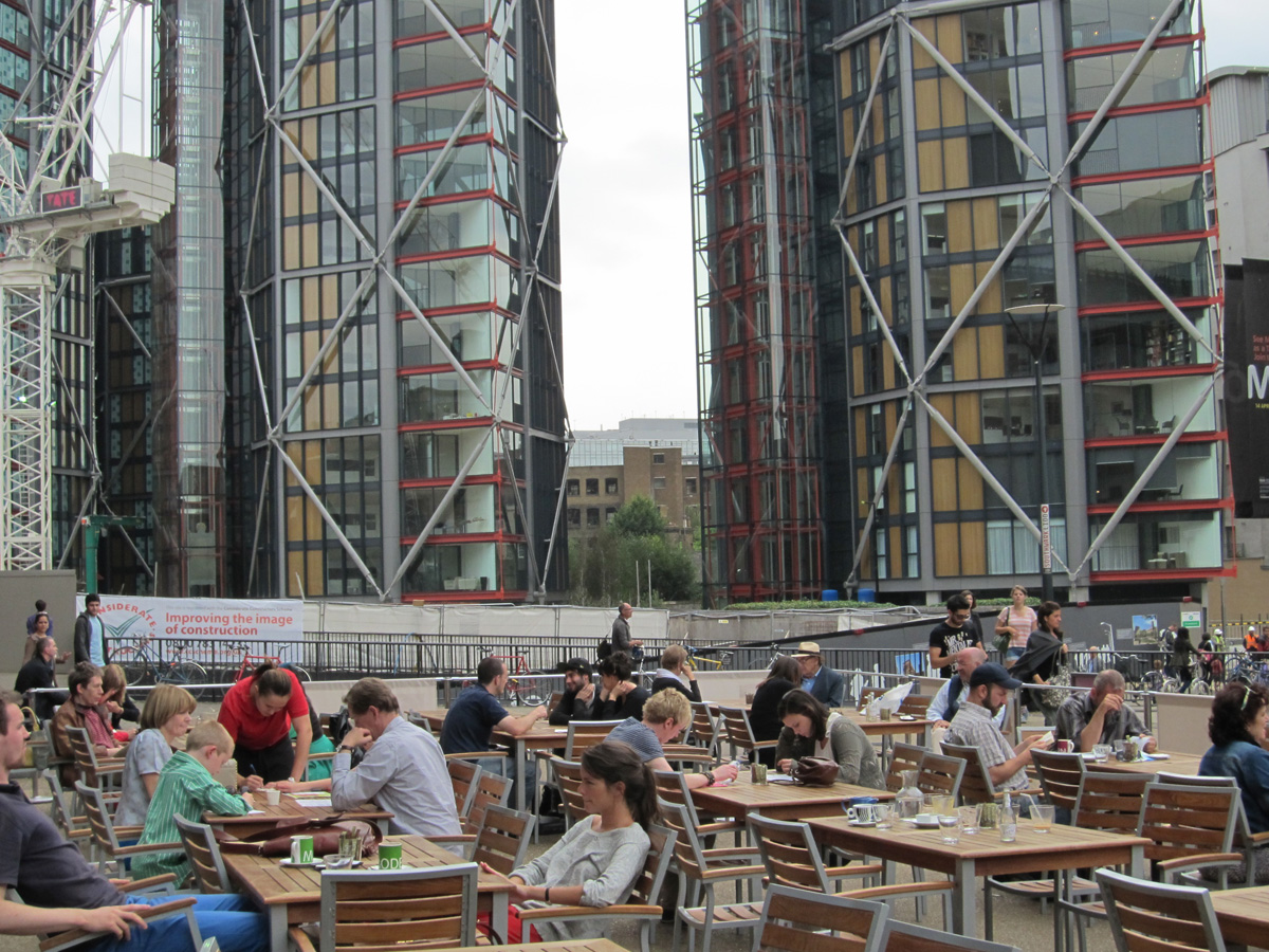

The subject becomes the cafe and its customers,
the buildings provide just the back drop
The buildings are the subject, the cafe
and its clientele provides 

foreground detail and balance


(2) Regent Street, London seen from Piccidilly Circus


The height of the buildings and curve of the street
have equal weight. Pedestrians add balance, interest 

and sense of motion
The landscape view emphasises
the curve of the street


(3) Office building at St Giles, London


The subjects are the building 
and the bus. The composition
is static. 
The subject is the view down the 
street, of which the bus and the building
are an important part. This composition 
is more dynamic


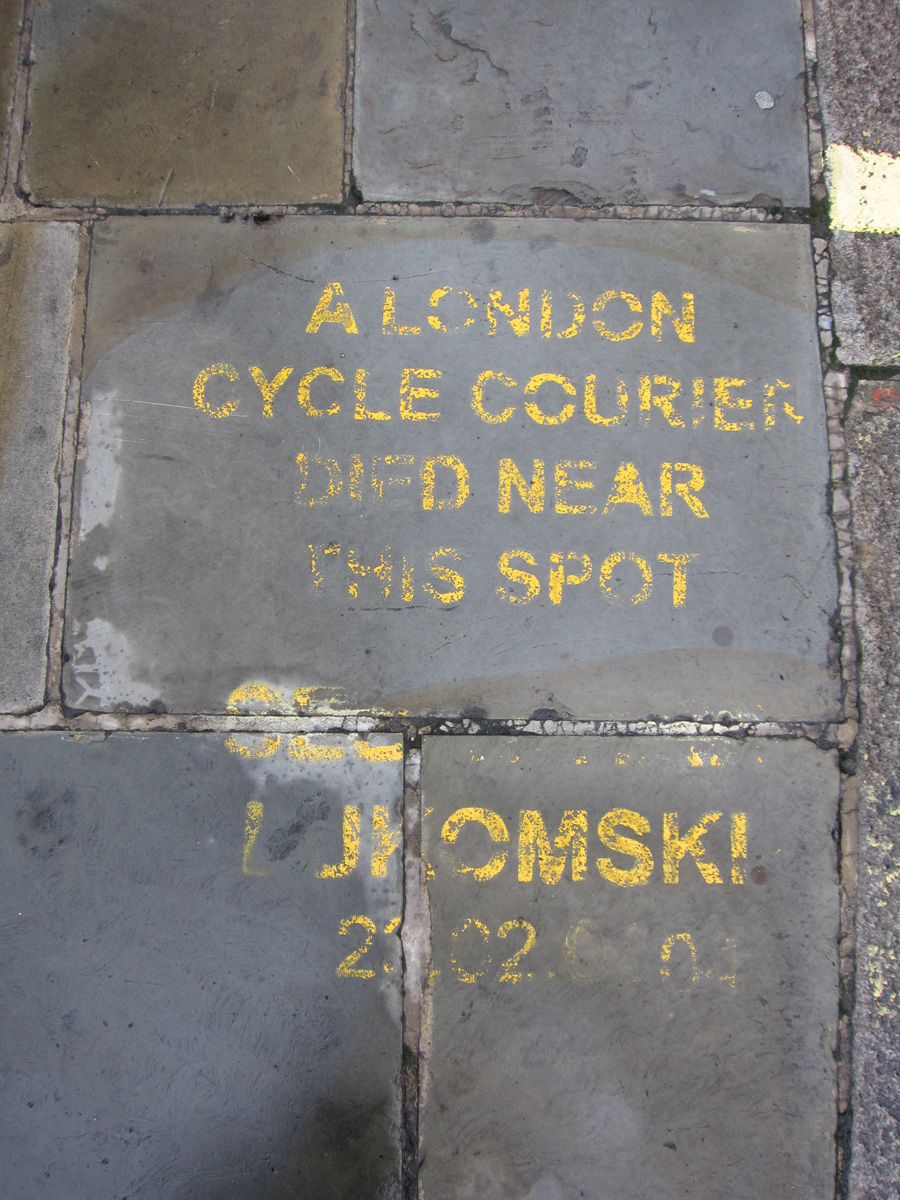
(4) Memorial to cyclist at Southwark Bridge


The landscape view shows the epitaph 
as well as its curbside context 
and provides some colour contrast
The portrait view focuses on 
the words of the epitaph


(5) Reuter's statue outside the Royal Exchange


The portrait view emphasises
height and allows more detail of
the statue dedication

The landscape view emphasises
width and includes more of the pattern 
of the windows of the background
building. This view has more rhythm.


(6) One of the many exits from Bank Underground station


More vertical detail encourages
the eye to move up and down. 
The space looks more narrow.
More horizontal detail encourages
the eye to move diagonally. 
The space looks wider.


(7) Shop at Soho street corner


Empahsises the height and 
shape of the building on the corner. 
The focal point is the shop
entrance.
Inceases perspective by adding 
a view down one of the streets.  
(Must exclude the detail at the edge
of the frame: adds nothing but
distraction).


(8) Watching the departures screen at Waterloo Station


The subject is the act of 
an anonymous traveller checking
the departure board

The subject becomes the rush hour, 
of which departure board 
 watching is a part


(9) The Millenium Bridge leading to St Paul's Cathedral


The subject is the flow of  people
over the bridge towards St Pauls
The dome of St Pauls is the subject.
The rails and people provide foreground
interest


(10) Waiting for the train at Bond Street Tube Station


Not a huge difference between
the vertical and horizontal view ...
... except this landscape shot 
provides more information on the
platform and completes the 
semi-cylindrical shape of the 
tunnel


(11) Tower and Blackfriars Bridges seen from the Millennium Bridge

More information on the sky
More information on Blackfriars Bridge


(12) Roundabout at Museum of London, London Wall


Rising multi-story office
blocks seen from the curve
of roundabout at the end of 
the walkway above London
Wall

The curve
of roundabout, with a partial view 
of the buildings in the background


(13) St Paul's Cathedral from the South Bank


Spectator looking at St Pauls
from the South Bank? 
Probably not, rather
looking at her outstreched
companion


(14) Building in St Giles High Street


Yellow cladding on office buldings
in St Giles High Street
Contrast of yellow and red cladding
on adjoining office blocks


(15) People on the balcony at Tate Modern


Spectators on the balcony
- positioned at lower end
of the frame for balance
Now positioned at lower end
of the frame. Keeps sense of height
but also adds width


Thursday, 8 September 2011

Positioning the horizon (1.3b)

Requirement
6 photographs

Purpose

To show the impact on an image of placing the horizon line (in an landscape) high, middle and low

Technical learning

  •  Many situations in composition demand a decision on dividing the frame into 2 or more distinct areas: for example,between colours, light and shade or,  most commonly, the horizon line between land and sky
  • In landscapes the choice of horizon line is important, particularly where the foreground lacks a point of interest
  • Placement of the horizon in the middle creates a static image, although a point of interest in the foreground reduces this effect
  •  A higher or lower horizon will be more dynamic, giving prominence either to the sky (low) or the foreground and land (high), which in the latter case also adds to the feeling of depth

Exercise instructions

Find a landscape with a clear horizon.  Consider the different positions in which you could arrange the horizon line. Take a picture of each option.


Images and Review
Burnham-on-Sea, Somerset enjoys a swing in tides that opens up its beach to create a vast flat plain of sand and sea. A great place to experience the elements. Each photo was taken under-exposed by 2/3rds of a stop to increase the contrast of the clouds and reinforce the stormy mood.
The stormy sky is the subject. The pier provides some foreground interest
The sky and the beach are both points of interest, placing the horizon line in the centre brings out the contrast in colour and texture between them.

The pier is the subject, to which the concrete path leads the eye. The sky and the beach recede into the background
I prefer the second image, because it has the most content, although the first has marginally more balance in tones and is slightly more dynamic.

Further learning
2 important considerations in deciding where to place the horizon line in a landscape are:
  • The relative levels of interest between land and sky. A dull overcast sky prompts placing the horizon line close to the top edge of the frame, whereas an exciting sky demands the opposite, unless also the foreground has features of interest.
  • The graphic effect. The natural tendency is to place the horizon line low in the frame: this adds to the sense of stability. However, balancing graphic elements, such as tones, textures or colours is also a consideration. 
Other images


The view from Tower Bridge from London Bridge after sunrise - shame part of the sky is blown out.

The Thames, the boats and the bridge  dominate. The sky is just background.

The sky and the ray of light start to feature

The sky is now the subject

Even more so here


The harbour at Chatham on the River Medway - a vertical frame and in black and white (as the colours were dull)

The python-like channel in the mud bank leads the eye to the moored boat. The boat  stops the eye from wandering out of the frame and send it back to the channel.

Balance between tones and content
More emphasis on the boat and sky
The sky is the subject the boat provides stability at the bottom of the image 


Wednesday, 7 September 2011

Balance (1.3a)

Requirement

6 photographs


Purpose
To show how to identify and create balance within an image by dividing the frame

Technical learning

  • Balance means equilibrium between two or more parts of something
  • It is fundamental to composition
  • It applies not just to where you position the subject but to every kind of arrangement
  • It occurs in several dimensions: tones, colours, shapes, textures, points, lines
  • You can show the visual balance of an image by using a ‘weighting scale’, as if the elements were placed on a board with a fulcrum at its centre

  • The chart shows combinations of how unequal objects can be made to balance by placing the larger ones closer to the centre and the smaller near to the edge of the frame
  • This type of symmetry, i.e. around 1 axis, creates static balance
  • Maximum symmetry occurs where objects or lines radiate around the frame’s centre giving


  • Balance does not have to be simply between two obvious, clearly-defined objects: it can be between: for example, an object and its background,  two different areas of tone, two different colours


Exercise instructions

Take 6 of your own previously taken photographs. Decide how the balance works. Look for the dominant part (or parts) of the image. Identify them in a small rectangular sketch.  Alongside mark down the ‘weighting scale’


Images and Review


Symmetry - shape, tone
Symmetry - tones
Symmetry - new/old building, tones

Symmetry - tones

Maximum symmetry 
Maximum symmetry

Thursday, 1 September 2011

Focal Lengths (1.2a)

Requirement
3 - 10 photographs

Purpose

To show the effect on angle of view, and therefore subject and image character, of using lenses with different focal lengths.

Technical learning

  • Focal length of the lens determines the angle of view and has an immense impact on the character of the image
  • Standard focal length (i.e. same length as the diagonal of the sensor or the film) gives a view that approximates what you see with your eye, although the eye loses sharpness at the periphery
  • Lengthening the focal length of the camera, whilst making the subject appear closer, is not the same thing a moving the camera closer: the telephoto shot reproduces the centre of its equivalent taken with a wide angle lens
Exercise instructions

Pick a scene that is open with some detail in the distance. Use a tripod.  Take a sequence of photographs aimed in the same direction using different focal lengths.  Vary the composition slightly if this benefits the image.  Make a note of the focal length of each image.


Images and Review
In a spare hour whilst traveling home, I walked up from the rather dull Euston Station on a rather dull day to the marvel that is St Pancras station. Its front entrance is as grand as another's elsewhere in the world, surely. All that Victorian wealth, civic pride and self confidence! Pulling my Canon compact out of my bag for these just in case moments. A bit of struggle controlling the zoom to suit, though.

4.5 mm - capture the sweeping curve  (3/4 of a black car is a distraction)
5.9 mm - keep as much of the curve as possible (again the black car is a distraction)
8.2 mm - focus on the leading line by waiting for a pedestrian
12.3 mm - highlight the pattern and enliven with some human figures
22.2 mm - find the detail (the trio of lamps) from which to zoom in closer
29.7 mm - get closer to the lamp (pull pack to include 3 full arches would improve)


45.3 mm
97.2 mm

  • Overall the effect of the zoom is to magnify the chosen sections of the original image:  the original perspective remains and so the magnified image is relatively flat, compared to shooting the same image closer to the subject with a wide angle lens.


Other Images
Here is an earlier attempt at this exercise, just round the corner from the main entrance to St Pancras Station. In reverse: telephoto to wide angle.

162 mm
81 mm

61 mm
26 mm

11mm