6 x3 = 18 photographs
Purpose
To identify primary and secondary colours and reproduce them in images
Technical learning
- 2 main systems of colour: 1. Painters (aka reflective, substractive) and 2. Light (aka transmitted, additive)
- Primary colours in the 'Painters' are: Red, Yellow, Blue. Primaries in 'Light': Red, Green and Blue.
 |
- The colour wheel helps to understand the relationship between colours: firstly, how some colours are created from others; secondly, how individual colours work in combination with each other.
 |
| Colour Wheel (Primaries, Secondaries, Tertiaries) |
- Primaries (Red, Yellow, Blue) combined produce Secondaries (Orange = red + yellow; Green = Blue + Yellow; Violet = Red + Blue).
- Primaries and Secondaries combined produce Tertiaries
Exercise instructions
- Find scenes, or parts of them, dominated by a single primary and secondary colours (red,
yellow, blue – green, violet, orange).
- With each colour that you find
vary the exposure slightly (+/- half a stop) to improve the chance of an
acceptable match with the colour in its pure state.
- Limit the choices of man-made
decorative surfaces (e.g. paint on doors).
- Spend time examining materials
in their natural colour (e.g. greens in vegetation, colours of flowers).
- Seek out backlit colours to
avoid surface reflections (e.g. yellow flowers) against a dark background.
- Consider underexposing bright
colours (organge, red, yellow) to make them more intense. Note, however, that it takes time to find
pure, simple colours: uncommon in real life.
Images and review
Warm Colours
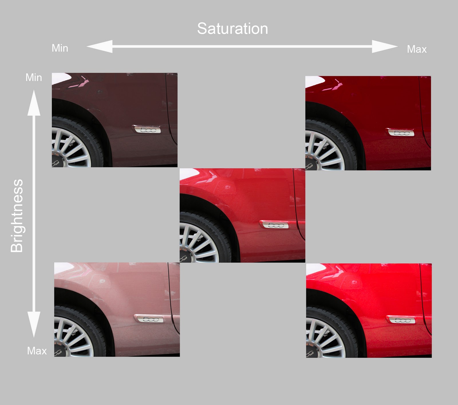
Red
Coca Cola Cans
 |
As shot - contains an orange cast
|
 |
| Minus 0.5 stop - more saturated and closer to pure red |
 |
| Plus 0.5 stop - increases orange colour cast |
Orange
Carrots
 |
As shot -
|
 |
Minus 0.5 stop - more intense
|
 |
Plus 0.5 stop - washed out
|
Yellow
Grapefruit
 |
| As shot - yellow is darker than pure |
 |
Minus 0.5 stop - has slightly more intense
|
 |
| Plus 0.5 stop - dayglow grapefruit |
Cool Colours
Blue
Rain on glass looking up to the sky
 |
| As shot - most faithful rendition |
 |
| Minus 0.5 stop - becomes muddy |
 |
| Plus 0.5 stop - too pale |
Green
Golden Delicious Apples
 |
| As shot - correct |
 |
| Minus 0.5 - too dark |
 |
| Plus 0.5 - too light |
Violet
Lucozade bottles
 |
| As shot - most accurate |
 |
| Minus 0.5 - murky |
 |
| Plus 0.5 - over bright |