Tuesday, 3 January 2012

Lines (2.2a) - vertical and horizontal


Requirement 

8 photographs


Purpose
To show the impact of on an image of using strong vertical and horizontal lines

Technical learning

  • Lines are often the edges of objects: contrast makes them stand out
  • Lines in photographs are reinforced by reference to the edges of the frame
  • Lines have 2 qualities: one graphic, the other expressive
  • The graphic qualities - divides the frame, helps locate elements within the frame, gives a sense of direction (along the line)
  • Expressive impact - varies with type of line

Vertical lines
  • Expressive impact: provides moderate sense of movement, confronts viewer
  • Examples: walls, posts, trees, standing human figure, road seen from high viewpoint, a row of objects seen from a high viewpoint

Horizontal lines
  • Expressive impact: strong locating impact, natural base for objects to stand on, seen as static, stable, having weight
  • Examples: horizon line, man-made flat surfaces, long shadows (light at low side angle), row of objects at same distance from camera, mass of objects seen at a low angle

Lines also occur by implication: our imagination makes connects individual points.

Project and review

Look for specific examples of vertical and horizontal lines: discover how some design elements occur and how common or rare they are.  Shoot 4 different examples of horizontal lines and 4 of vertical ones. Make the line what the viewer sees first.


Horizontal


Leeks in supermarket display


Regular stacking of leeks create
powerful horizontal lines


Wooden roof


Shadow on edges of wooden strips on roof create
a series of strong horizontal lines


Steel and glass roof of Canary Wharf DLR Station


Steel supports for intricate
glass panels of roof produce sillhouettes
of thick, irregular horizontal lines
Ornamental egg and against Venetian Blinds

Daylight on the edges of the closed Venetian Blinds
creates a series of horizontal lines (as
well as shadow lines on the egg)


Vertical


TV masts in Dorset


Masts dominate naturally dominate landscape, so
eye level viewpoint is enough to make them 
appear prominent
Wooden Yogi Sculpture


Shot from a low angle with
a macro lens to emphasise
height of sculpture


Trunk of dying tree 


Grain of wood runs vertically,
empahsised by converting
image to black & white


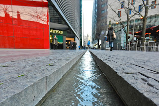
Water gully at One More London


Wide angle lens close to surface of gully
emphasises the lines. Also works as a triangle


Friday, 30 December 2011

Points (2.1c) - multiple points


Requirement
6 photographs

Purpose
To show how implied lines exist between multiple points, creating a shape or movement

Technical learning
  • A group of points implies either a network of lines or a shape
  • Grouping objects/ people in an active way is a key factor in producing a successful still life
Project and images
    Set up a still life composition on a simple (but not plain) background. Identify 6 to 10 identical, or at least similar, objects. Organise these objects into a shape. Fix the camera firmly in position and aim at the composition. Control the group by re-arrangement. Consider each move and its effect. Shoot 6 images. 

    Decided to look as much as possible for points forming shapes that occur without my intervention. This led to the first 5 images below. The 6th image is a still life arranged by me.


    Tree stumps in a wood


    Several triangles (e.g. front 4 stumps, 
    middle plus bottom 2, middle plus 2 in left half).
    Outside 5 stumps make a a pentagon. 
    4 in top half form a square


    London Eye in the mist


    Line of pods create a parbola


    Anchors on a wall, London Embankment


    Outside 4 anchors create a square
    4 sets of triangles around anchor in middle 
    (top and bottom halves, left and right halves)
    Water bowl with flowers


    Flowers create a pentagon


    Door at entrance to Paternoster Square, London


    Rivets in wood form a rectangle


    Stone Backgammon Board


    Counters on board create an arrow
    inside the rows of triangles on either side


    Wednesday, 28 December 2011

    Points (2.1b) - relationship between points

    Requirement
    3 photographs


    Purpose
    To show how 2 points create a relationship between each other as well as introduce energy into the image


    Technical learning

    • As with a single point in a frame, a relationship exists bewteen the point(s) and the frame. However, a relationship is also exists between the 2 points themselves.
    • The eye is drawn to one and then the other
    • This sets up (a) an implied line and direction within the image as well as (b) a vaguely defined space around them
    • One of the points usually attracts more attention than the other, where it is (a) bigger, (b) nearer to the foreground or (c) closer to the centre
    • Sometimes both points attract equal attention, i.e. where they are the same size, symmetrical to the centre, the same distance from the camera
    • Unresolved tension can energise an image, although taken to extremes this can damage the composition.
    Project and images
    Identify a situaton with 2 points. 
    • Produce an image where the points are equal in the frame
    • Produce another image where one dominates by size
    • Produce a third where one dominates by colour
    In the last two photos, identify the point which is stronger and why.


    Building site in West End, London


    2 points of the same size
    Close-up of a hoarding advertsing the construction of an office block, Holborn, London


    The bottom point dominates as it occupies
    more of the frame 
    2 climbers on a rock face


    The lower climber attracts the eye slightly more
    than his partner because of the
    warmer colour of his clothing, red shirt vs
    blue one. If, for example,
    his back pack would have been yellow, he would
    draw the eye even more strongly.

    Tuesday, 13 December 2011

    Points (2.1a) - positioning a point

    Requirement
    6 to 12 photographs


    Purpose
    To show how points create attention and movement


    Technical learning

    Points are a fundamental design element


    What is a point? 
    • A subject becomes a 'point' where it is small in the frame and contrasts with its background (e.g. a boat on a larger expanse of water)
    What role does it play? 
    • It draws attention to the subject - if it fails to do this (say, if the subject is too large relative to its background), the subject is not, or stops being, a point
    How do you position a point in the frame? 
    • 3 options: middle, off-centre or near the edge. 
    • However, your choice of location must add meaning or impact to the image
    • Balance, equilibrium between the elements, is also important 
    Project and images
    1. Note as many situations of images with points
    2. Review own past photographs and note obvious points
    3. Shoot 3 images showing examples of points: middle, off centre and close to the edge of the frame.
    Stable centred point, divides the frame symetrically
    and holds the eye fixed in the middle. Contrast to create
    the point comes from difference colour, sharpness and texture
    Slightly off centre, forces the eye to explore the edges
    of the frame before returning to the point.

    Point in upper right part of frame, encourages the eye to
    move to the framme edges, back to the subject and then to
    repeat this journey. Creates tension.


    • consider the relationship the point has in each frame, in terms of movement and division
    • movement arises from the relationship between the points and the sides of the frame
    • division arises from imaginary lines running through the  point across and down towards the edges of the frame.

    Monday, 31 October 2011

    The Frame - Contrasts (Assignment 1)


    Requirement
    • 8 pairs of images showing different contrasts in each pair
    • 1 photograph that shows the contrast in one picture


    Technical learning
    • Johannes Itten of the Bauhaus developed modern theory of contrast in art, design and architecture in the 1920s
    • This theory has translated easily into photography
    • Itten set his students an exercise similar to this assignment, intending that they approach the task from 3 directions: experience the feeling of the contrast before seeing it as an image, decide how to communicate that feeling, produce an image that conveys this sensation.
    • Some contrasts to consider:
    Large/small
    Many/few
    Transparent/ opaque
    Broad/ narrow
    Diagonal/ rounded

    Long/ short
    Pointed/ blunt
    Liquid/ solid
    Light/ dark
    Hard/ soft
    Thick/ thin
    Smooth/ rough
    Strong/ weak
    Much/ little
    Light/ heavy
    Continuous/ intermittent
    Black/ white
    Still/ moving
    High/ low
    Straight/curved
    Sweet/ sour
    Exercise instructions
    Review own photos to assemble pairs that represent different contrasts. Identify subjects that best express extremes of different visual qualities – colour, tone, lighting, comparative relationships between subject and background.  Shoot 8 pairs of photographs (either separately, or in one picture). Shoot 1 photograph that presents a contrast in a single image.


    Images and Review


    Tutor's feedback on the assignment- overall comments
    Interesting and imaginative first assignment. Having dispensed with the suggested pairings you've made some of your own, in some cases quite advanced. However, there are a few too simple colour contrasts in the set: did you miss the point of the assignment?

    Improve your presentation:

    • mount your prints on white card
    • make them at least A5 size rather than 4 x 6 inches
    • give each print a title
    • label each print with your name and student number


    A. Contrast in one image 


    View of St Pauls Cathedral from One Change Alley


    Old vs New architecture
    Stone vs Glass materials
    Spiritual vs Material Values
    Light vs Dark
    Curves vs Lines

    Contrast is strong. Composition works well - the eyes are drawn to the cathedral by both lines and the dark to light relationship and St Pauls stands out against a blue sky.


    B. Pairs of contrasts


    (1) Man and his dog on beach at Burnham-on-Sea vs rush hour on London Bridge

    Peaceful and spacious
    Hectic and cramped


    Contrast is unconvincing.  Difference here is between Near and Far, not really between Tranquillity and a Hectic Atmosphere. Perhaps consider another wide shot, horizontal format, with similar distance framing, but using a subject like traffic, or the same walkway (bridge?) but from a distance. Zooming in tends to create a sense of intimacy. And in fact, the man on the phone doesn’t look hectic at all, but seems quite relaxed.


    (2) Flowers in Vivary Park, Taunton

    Blue
    Pink


    A bit more front lighting would have helped you get more detail out of the centres.


    (3) Second hand popular novels stacked horizontally vs vertically

    Horizontal
    Vertical


    This depends too much on the way you orient the photos. Here you could have better photographed something less likely to be oriented either horizontally or vertically – for example, a vertical tree and a horizontal felled tree.


    (4) Sanxenxo bay vs Fields in Hirzel

    Blue seacape at dawn
    Green landscape at midday


    More impact if you had used the same location, viewpoint with the same subject rather than changing subject. Could have improved the blue dawn photo with a wider angle to get more of the curved line of the cove in the shot. That line – as a graphic – stands out well in the blue light. 


    (5) Dawn seen from Glastonbury Tor

    Colour
    Monochrome


    Excellent. Nice pairing, Great composition - great vantage point and use of foreground trees to frame. Perhaps remove white spots on print of colour shot?


    (6) A Swiss barn and One London Wall

    Country
    City


    Good idea. Well composed - accented by blues and greens, 2 figures in City shot. However, contrast will improve if you keep the same orientations to avoid the impression that the images do not relate to each other (which unpicks the attempt at contrast)


    (7) Bins

    Nearly empty
    Over full


    This contrast doesn’t work because you haven’t set up a viable standard. If you take two identically framed shots of a dustbin, one full and one empty, the contrast in states is emphasized. But here you’ve changed viewpoint. The ‘full’ shot is just an edge, there is no sense of ‘fullness’ there.


    (8) One logo vs another in adjoining shop windows, Soho

    Red circle on white background
    White circle on red background


    Yes, good spot but too simplistic