Sunday, 3 February 2013

Assignment 3 - Colour

Requirement
16 images

Assignment instructions
Take 4 x 4 photographs that illustrate the following colour relationships:
  • harmony through complementary colours
  • harmony through similar colours
  • contrast through contrasting colours
  • colour accent using any of the previous relationships
Vary subject matter between still-life and found scenes.

Use lighting and filters to help create colours

Make notes about the way colour works in each image

Sketch how balance and movement works in each

Images and review

Tutor's comments

Overall

  • Mostly a good understanding of the use of colour but the close simple nature of the subjects lets it down
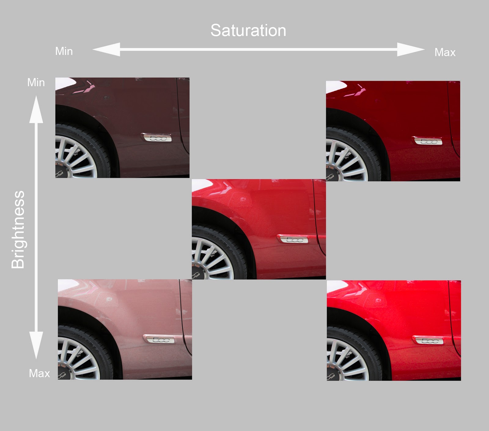
  • Prints submitted for review were not as saturated as they appear in the blog (especially: 1, 2, 5 and 9). Need to improve print quality.
  • Blog is well ordered but light in the important areas of (a) evaluating what does and does not work visually, de-constructing images in terms of colour, light and design and (b) revealing purpose and thinking behind images
Suggestions for next section - Light

Photographers
  • Trent Parke
  • Boris Savelev

Approach

  • Make monochrome and colour images, at different times of day and different weather conditions
  • Make use of flash, both for interiors (bounced) and fill flash for exteriors in daylight to add emphasis


Complementary colours - harmony


Use of colours that are polar opposites on the Colour Wheel. Key combinations are: red and green, blue and orange, violet and yellow.

(1) Red and Green


Shoes on sale 
on display in window of Super Dry store in Covent Garden, London.
Red and green are approximately as bright as each other,
so are harmonious in equal quantities, as here.
Needs adjustment of the white balance to correct the effect of artificial light. Might be improved if the background darkened.

(2) Blue and Orange


Highlighter Pensstill life in makeshift studio in spare bedroom.
Pure orange is roughly twice as bright as pure blue, 
although in this image the orange is darker and the blue
lighter than pure. So, harmony comes from
adjusting the quantities of each colour to reflect this.
(HDR Software used on bracketed images to mimic
how advertising might present these objects) 

(3) Red and Green


Crane against office building 
near Broadgate, London
Red of the crane is brighter than the
green of the panels in the office building, so
quantities adjusted accordingly.
Consequently, harmony comes from including more
of the office in the frame than the crane,

Red crane somewhat over-saturated

(4) Red and Green


Autumn Leaves #1
The equal relationship of warm red/orange
and range of greens creates harmony.
(Image comes from panning on a slow 
shutter speed between trees.)


Similar colours - harmony

Use of colours that lie adjacent to each other in the Colour Wheel

(5) Red, Yellow, Orange and Violet


Autumn leaves #2
The leaves cover the warm colours of red,
orange and yellow, as well as violet, adjacent
to red
(6) Shades of ochre


Colonnade
near the piazza in Verona, Italy.

The stone as well as the light and shade create
tones of yellow
Why didn't you frame the entire colonnade?  [people, cafe furniture and bright light at the end distracted from colour effect]

(7) Blue and Green


Olympic pennants
in the piazza at Covent Garden, London.

The image has 2 areas of Blue (one the foreground
set of flags, the other the sky seen through
glass panels) and 2 areas of Green (one the
background, the other the roof supports)

(8) Red and Yellow


Pears on a book
still life in makeshift studio in spare bedroom.

Two adjacent warm colours
The muted yellow of the pear and its lesser size
compensate for the higher brightness of
pure yellow compared to pure red
Watch out for leaking light turning dark backgrounds grey (top right). 

Contrasting colours - contrast

Use of colours that lie one third of the way around the Colour Wheel. Key combinations are: red and blue, red and yellow, orange and green, orange and violet, blue and yellow, green and violet

(9) Orange and Violet

Door and wall
at a restaurant in Covent Garden, London.
The darker mauve stands at the opposite
end of the Colour Wheel from this
(slightly muddy) orange. Contrast
toned down by including more mauve 
than orange.

(10) Yellow and Blue

Office block
at St Giles Circus, London.
The bright yellow stands out against
the (rare) clear blue sky


(11) Yellow and Green


Flip-flops on display
in Super Dry store in Covent Garden, London

Both yellow and green flip-flops are very
bright colours (probably visible from
out of space)
As green and yellow are adjacent colours, this belongs in Section 2 - Similar Colours: Harmony. 

(12) Red and Blue

New office block
in Cannon Street, London.

The red advertisement around the revolving door
contrasts with the blue backlit panels behind
reception

Take more care in composition - this creates the impression of being a snap.


Colour accent - harmony or contrast

Use of a dominant colour set with a small quantity of a contrasting colour which creates a point of focus in the image

(13) Green accent on Red


Apples on display 
at local Waitrose (thanks to manager for
giving permission)
The green apple catches the eye amongst
the display of similar red apples 

(14) Yellow, Blue, Green and Orange accents on sky Blue


Ferris Wheel at Summer Fair
in New England, USA.

The sequence of 4 colours of the chairs
stand out as points as well as provide
rhythm to the image. 

The yellow and orange chairs
advance as warm colours, the green
ones to a lesser extent.
(15) Red accent on Blue

Crane reflected in glass 
in New Fetter Lane, London.

The red diagonal cuts across the middle
of the building. Being a warm colour it advances
on the blue (sky reflection) of
the building

(16) Pale Blue accent on Pink


Alternative therapy centre
in Covent Garden, London
Eye catching name!
Pale blue stands out against pink
colour of upper wall
These colours are pale, subdued and belong in the Similar Color section.

Saturday, 15 December 2012

Colour Relationships - Tones in B&W (3.3b)


Requirement
4 images

Purpose
To understand how colours affect tones in black and white images

Technical learning
  • Black and white photography has revived in the digital era: post-production makes 2 important features easy - monochrome conversion and adjusting tones to suit intent
  • Colour filters brighten their applicable colours and darken their opposites, e.g. a red filter enhances reds but darkens blues.

Exercise instructions
  • Make a still life with 4 objects: 1 coloured red, 1 yellow, 1 green and 1 blue on a mid grey brackground 
  • Take 1 photograph
  • Convert image to monochrome in Photoshop
  • Produce 4 further images by dialling up in the monochrome conversion tool (a) the red component, (2) blue, (3) green and (4) yellow. 
  • Each case keep the tone of the grey bcakground unchanged

Images and review
A favourite old coffee mug almost fits on its own the subject requirement for this project. Large Orange (instead of Red), Green and Blue Polka dots on Yellow. The neutral grey came courtesy of a predominantly grey packing blanket lying forgotten in the garage.


Colour Original
Converted to black and white without colour filtering effect


Neutral Monochrome
After applying Blue filter effect..


Blue Polka Dot assumes a light tone
whilst all of the other (brighter) colours become
signficantly darker, most noticeably
the Yellow and Orange
After applying the Green filter effect...


Green Polka Dot becomes lighter, the Blue is unchanged,
whilst the Yellow and Orange have turned
a shade darker
After applying the Orange filter


Orange, Yellow  and Green Polka Dots lighten, the
Blue darkens
Finally, after applying the Yellow filter


Orange, Yellow  and Green Polka Dots lighten, the
Blue darkens. In fact the Orange and Yellow filters
have largely the same effect, at least to the eye, due
to the proximity in the inherent brightness
of these twi colours


Friday, 30 November 2012

Colour Relationships (3.3a)

Requirement
6/7 images

Purpose
To identify how to use colour relationships for physical and emotional impact

Technical learning
The key types of colour relationship are:

Complementary 
  • What is it? Combining 2 colours opposite each other on the colour wheel. (e.g. G/R, B/O, Y/V). This also combines warm (advancing) and cool (receding) colours
  • Impact?  High-contrast but also harmonious, especially if brightness is balanced (Scale: Y = 9, O= 8, R = 6, G = 6, B = 4, Violet = 3)
Monochromatic 
  • What is it? Using different shades of the same colour
  • Impact?  Clean and elegant. Soothing, easy on the eyes, especially in blue or green.
Analogous 
  • What is it? Colours adjacent to each other on the colour wheel. Oten 1 colour is dominant while others enrich the scheme. 
  • Impact? Similar to monochromatic, with greater nuances. Consider either staying within warm and cool range, or crossing over.
Split Complementary
  • What is it? 1 colour contrasted with the 2 colours adjacent to its complementary (e.g. R/ B & Y, O/ V & G)
  • Impact? High contrast, with less tension from using complementary colours

Triadic 

  • What is it? Use of colours equally spaced around the colour wheel (e.g B/R, B/Y, Y/R, Y/G, Y/V)
  • Impact? Contrast, yet harmonious, balanced and rich in colour


Exercise instructions
Part 1

  • Shoot 1 image for each combination of primary and secondary colours
  • Follow the ratios that balance their relative brightness 

Part 2 

  • Prodcue 3 or 4 images with colour combinations (2 or more) that you like
  • Be aware of balance/ imbalance and consider its effect


Images and review

1. Complementary pairs


Green/ Red

Sex Shop Window
Colour complements appear in all
walks of life!


Orange/ Blue

Building worker crosses Blackfriars Bridge, London
Orange fatigues contrast with the blue
of the sky


Yellow/ Violet


Flowers in a supermarket
Violet (reddish) petals, red centres
Combination is rarer than other 2 complementary pairs


2. Appealing pairs

1. Blue, Red and White

London Eye at twilight as seen from Waterloo Bridge
Strong circle of blue, red and white
(the union flag)


2. Warm and Cool colours in shapes

Fencing outside school in London
Mixes warm colours (red and yellow mainly) with 
cool ones (shades of blue, a dash of green), as well
as squares, circles and rectangles

3. Analogous - blues and violets at night

National Theatre at nightime
The camera sees colour more vividly at
night than the eye. Lighting at night projects
colour onto light brown concrete wall
that look so uninspiring during t
he day 

4. Analogous - red, orange and yellow


Canoes for hire, Lyme Regis
Red, orange and to a lesser extent yellow
Balance comes from more red than orange and 
more orange than yellow.
Blue sky background isolates boats: a cool colour
vs. warm ones

Friday, 15 June 2012

Colour - Building a Library of Colours (3.2)

Requirement
6 x3 = 18 photographs

Purpose

To identify primary and secondary colours and reproduce them in images

Technical learning
  • 2 main systems of colour: 1. Painters (aka reflective, substractive) and 2. Light (aka transmitted, additive)
  • Primary colours in the 'Painters' are: Red, Yellow, Blue. Primaries in 'Light': Red, Green and Blue.
  • The colour wheel helps to understand the relationship between colours: firstly, how some colours are created from others; secondly, how individual colours work in combination with each other.
Colour Wheel (Primaries, Secondaries, Tertiaries)
  • Primaries (Red, Yellow, Blue) combined produce Secondaries (Orange = red + yellow; Green = Blue + Yellow; Violet = Red + Blue). 
  • Primaries and Secondaries combined produce Tertiaries

Exercise instructions

  • Find scenes, or parts of them,  dominated by a single primary and secondary colours (red, yellow, blue – green, violet, orange).  
  • With each colour that you find vary the exposure slightly (+/- half a stop) to improve the chance of an acceptable match with the colour in its pure state. 
  • Limit the choices of man-made decorative surfaces (e.g. paint on doors).  
  • Spend time examining materials in their natural colour (e.g. greens in vegetation, colours of flowers). 
  • Seek out backlit colours to avoid surface reflections (e.g. yellow flowers) against a dark background. 
  • Consider underexposing bright colours (organge, red, yellow) to make them more intense.  Note, however, that it takes time to find pure, simple colours: uncommon in real life.


Images and review

Warm Colours

Red
Coca Cola Cans

As shot - contains an orange cast
Minus 0.5 stop - more saturated and closer
to pure red
Plus 0.5 stop - increases orange
colour cast


Orange
Carrots 

As shot - 
Minus 0.5 stop - more intense
Plus 0.5 stop - washed out


Yellow
Grapefruit
As shot - yellow is darker than pure

Minus 0.5 stop - has slightly more intense
Plus 0.5 stop - dayglow grapefruit


Cool Colours

Blue
Rain on glass looking up to the sky

As shot - most faithful rendition
Minus 0.5 stop - becomes muddy
Plus 0.5 stop - too pale


Green
Golden Delicious Apples

As shot - correct

Minus 0.5 - too dark

Plus 0.5 - too light


Violet
Lucozade bottles

As shot - most accurate


Minus 0.5 - murky
Plus 0.5 - over bright


Wednesday, 6 June 2012

Control the strength of colour (3.1)

Requirement
5 photographs

Purpose

To show how colour brightness changes with exposure, whereby under-exposure darkens hue

Technical learning

  • Monochrome images, with their currency of contrast and brightness, help focus attention on line, shapes, textures and tones
  • However,  colour - as a design element - works differently and often produces a strong response, emotional as well as physical
3 qualities of colour

Hue
  • Essential quality of how we name colour e.g. red, blue, etc. 
  • Primary colours are 'irreducible', i.e. they cannot be created from mixing other colours. 
  • 2 basic systems: reflective (or painters') and transmitted (light). 
  • Painters' primaries are Red, Yellow and Blue. Light primaries are Red, Green and Blue. (the Red and Blue of each system are different)
  • Secondary colours are created by mixing 2 primaries in equal amounts. 
  • In the painter's system: Green = Blue and Yellow, Orange = Red and Yellow, Violet = Blue and Red. 
Saturation 
  • Purity or intensity of a colour from grey. 
  • At full saturation a colour contains no grey at all. 
  • Conversely, at low saturation the colour would be mostly grey.
From desaturated to fully saturated

Brightness
  • Degree to which black (shade) or white (tint) is mixed with the hue at a given saturation. 
  • At one end of the scale is pure white, at the other pure black.  
  • Judge brightness from ‘very dark’ (shade) through ‘average’ to ‘very bright’ (tint) 
Tints of yellow
Shades of yellow
Note - charts sourced from Designing for the Web by Mark Boulton 
http://designingfortheweb.co.uk/book/index.php


Saturation interacting with brightness 
  • The chart below shows how for a red hue of the car body part extreme changes in saturation and brightness interact. 
  • I created this chart from the photograph of  a red car, shot in RAW and adjusted the saturation and lightness in Photoshop. 


  • Central image: The (impure) red car body part as shot by me
  • Min Saturation: Min Brightness: Desaturation towards a grey tone, darkened by lowering brightness (adding black) to produce a near black. If the car body was pure red, the result would have been black
  • Min Saturation: Max BrightnessDesaturation towards a grey tone,  lightened by increasing bightness (adding white) to produce pink. If the car body was pure red, the result would have been white.
  • Max Saturation: Min Brightness: Full saturation of red content, darkened by lowering brightness (adding black) to produce a deep maroon
  • Max Saturation: Max Brightness: Full saturation of red content, lightened by increasing brightness (adding white) to a day glow red
Control over saturation - exposure
  • Several techniques give you control over colour at the time of shooting – one of the most basic is saturation

Project and review


Find a strong colour, e.g. a painted door. Fill the frame with the coloured subject. Take 5 bracketed exposures: average +/- 0.5 and 1.0 stops.  The underexposure reduces the brightness of the image and conversely overexposure increases it.

Leaf in close up

- 0.5 stop
- 1 stop

Average exposure


+ 1 stop
+ 0.5 stop